Monday, 24 March 2014

Construction Project Day #13

Day 13 and already nearly two weeks of new ideas and making. From this time already my studio practice feels much healthier and my work is developing rapidly. I am enjoying getting in and spending time in my creatice space at Rogue Artists' Studios, I have used this facility more in 2014 than ever before. 

Today I invited my mum (Jenny West) into my studio to work in the same space together for the day, we both need encouragement from each other every once in a while - mother/daughter + artist-to-artist feedback is great. Mum/Jenny has been a practicing artist all my life, even undertaking a artists' residency at The Whitworth gallery when pregnant with me.
Drawing has been the main focus of Jenny West's practice for the last twenty years. "Initially the process of drawing was necessary to explore, plan and invent sculptural forms in order to prepare for their construction in three dimensions." Recently she has developed drawings which exploit the mathematical perspective and geometry of domestic objects, to produce delicate spatial drawings. By working directly onto the walls of buildings, unfolding and extending images out into the space with thread and wire, the work, no longer confined to illusory representation on a flat surface, has physically interacted with the fabric of the architecture leading the viewer on a journey through real space.
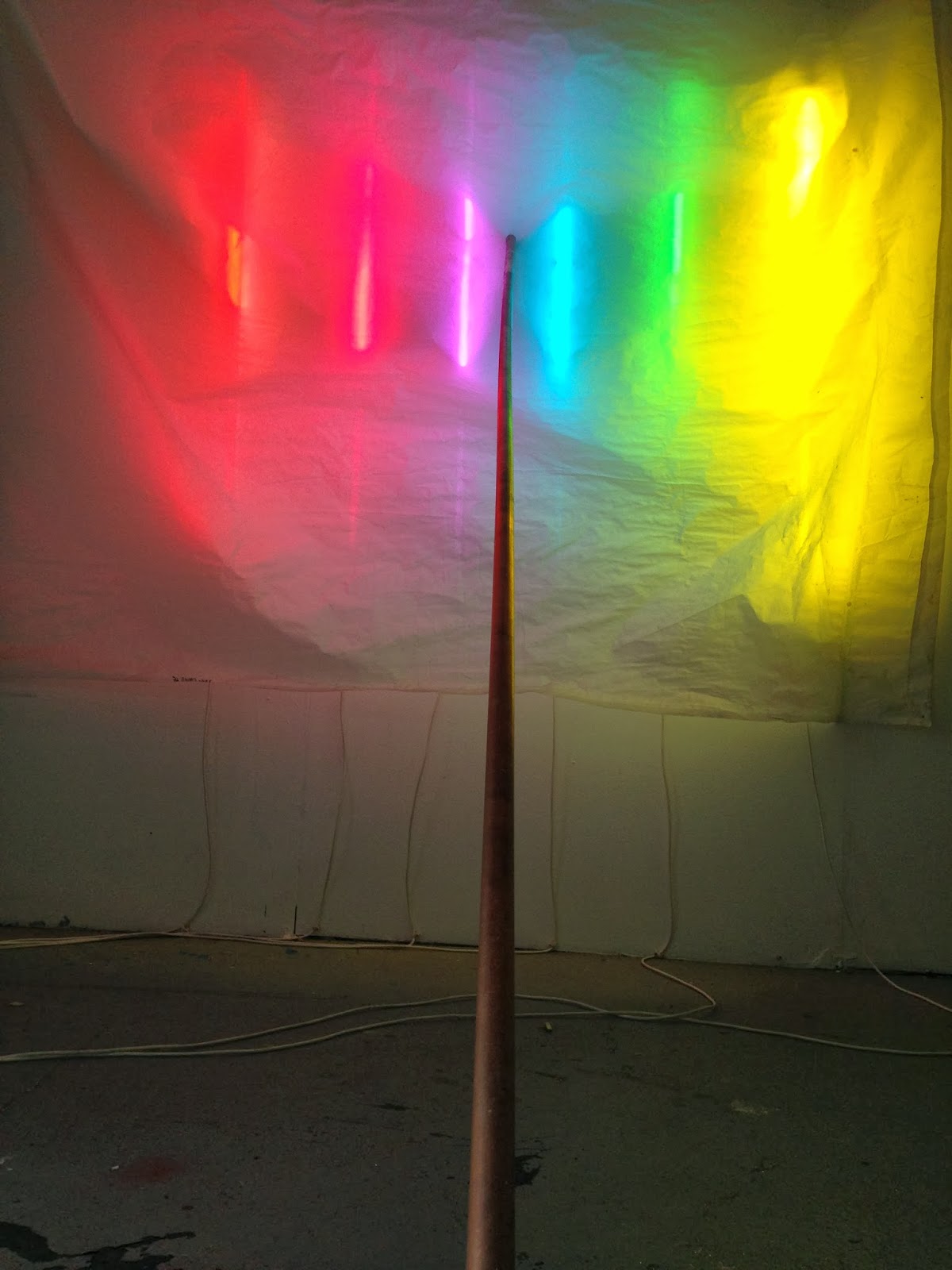
While she took over my desk making drawings/collages, I used the studio floor and walls to make further developments with my light-work. I added elements to my original construction - as you will be able to see from these photographs.


As the day progressed, I added and transformed the wall-based work to become a floor-based work:


ps. I do realise these are very Batchelor-esque. My mother was kind enough to point this out! 

Friday, 21 March 2014

Construction Project Day #12

Today in the studio I decided to STRIP it down to just my fluorescent lamps, using them to make shapes of light in an attempt to simplify my arrangements and build sculptures from them as formal structures.

My first arrangement shows two triangles, one on top of each other, held up only by one clip against the wall of my studio. The top triangle consists of the primary colours and the bottom the secondary colours. The lines of the top and bottom triangles correspond with their complimentary colours, i.e. red and green on the left.


My second arrangement was wall-based, yet protruded out into the space. Held together by a single white fluorescent stick (not switched on), this piece allowed the viewer to move around it, get behind it, gauging it in a completely different way to the first piece. One of my favorites of today's work.


I then made a suspended triangle, which started life as a floor-based piece. I suspended the stick-light triange from a cable attached to the studio ceiling. The weight of the lights against the fragility of the single cable holding the structure up offered a tension between the two elements.


On another day, I would be interested to trial another simple shape, watch this space...


Thursday, 20 March 2014

'Let there be light' Liz West is cover artist for March issue of Exeter Living


To coincide with West's current exhibition An Additive Mixture at Gallery333, Exeter Phoenix, Exeter Living Magazine have used one of her images as the cover image for March 2014 issue.

An Additive Mixture has now been extended until 26 April. More info: www.exeterphoenix.org.uk/events/liz-west

Wednesday, 19 March 2014

Liz West Vanishing Boundaries at MediaCityUK

West shows new work for the Future City festival, aiming to bring the best British contemporary digital artwork to Greater Manchester  

Five large scale cutting edge contemporary artworks in public spaces at Salford Quays and MediaCityUK will form a season of visual and aural wonder over four weekends in March and April.  Anybody who has visited The Quays knows it is an iconic location of both historical significance and technological innovation. This stunning festival, Future City, reflects that perfectly, with artworks that combine humour, current affairs, and awareness of place or refer back to Manchester’s history.

Audiences are invited to come and enjoy each of these artworks for free over four weekends. A series of artists’ talks will run alongside this series hosted by Future City’s partners and co-curators, University of Salford.   


From now until the 29 April, North-West based artist Liz West will be showing work Vanishing Boundaries at MediaCityUK as part of Future City festival.

An array of reflective discs protrude above floor level in this striking light installation. The only indoor piece in the Future City series, Vanishing Boundaries will be brightening up the foyer of the studios at MediaCityUK for six weeks. The installation emits intense bursts of light from underneath the discs; the floor is transformed into a field of colour, connected by the trailing electrical wires.   

MediaCityUK, Broadway, Salford, M50 2EQ
www.thequays.org.uk/whats-on 
0161 876 210


Wednesday, 12 March 2014

Construction Project Day #11

Once again, I insist that I only show images of my work instead of any writing in this post, so as to not inflict any readings the work may give you.

I think it is clear from the photographs the process I took on day 11 in my studio at Rogue.


Monday, 10 March 2014

Construction Project Day #10

I have decided not to include any text (other than this) for this blog post as I think the images give an indication as to how my thought process developed today.


Tuesday, 4 March 2014

Construction Project Day #9

As a development from Day 8, I have produced this work consisting of 3 flourescent stick-lights wrapped in primary coloured cellophane which stand on their corresponding coloured acrylic panel.

I would like to add to this work in terms of floor space covered and amount of lights used to test what it looks like and how much light is given off.

The bulbs were suspended from the ceiling by their power cords, the bulbs were not hung vertically (resembling designer lighting) or horizontally (as in my past works), instead an odd tension was created by hanging them at angles. This I preferred.


As you moved around the work the hue changed as did the formal arrangement and relationship between the lamps.  The reflection in the glossy acrylic sheets below added another important dimension which was necessary within the work, doubling the amount of light given out.